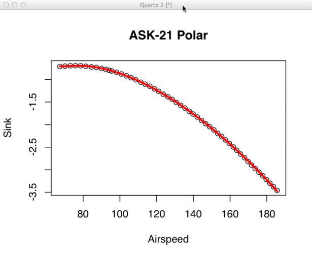
The next step is to use linear modeling to find the coefficients (A, B, C, etc.) in our model equation. So that we remain consistent with the factory polar the first thing we need to do is make all the sink rates negative by multiplying them by -1 (see the R log below). Then plot the raw data and give it a title of “ASK-21 Polar”. Since I’m using an OS X machine I have to add the ‘family=”sans”‘ parameter to the plot function to get the axis labels to appear. Yes, as far as I’m concerned, this is a bug. The plot is shown below with the raw data and best fit plotted on it.
The third line contains the call to the linear modeling function. The parameter to lm() is a modeling statement which is “pronounced” Sink is modeled (~) by the following equation (which does NOT contain A, B, C, etc). The I() functions apparently are needed to make sure R interprets “Airspeed^2” as a mathematical function and not something else. Don’t ask me what that something else is! I’m not an R expert, I just do what works.
The fourth line causes a summary of the fit to be printed. THIS IS THE GOOD PART!! There’s a bunch of stuff here but the numbers we’re most interested in are under the “Estimate” column plus the “Adjusted R-squared” parameter. The numbers under the “Estimate” column correspond to, in order, E, A, B, C, D in our original model statement. Substituting these numbers in our original model gives us an question that looks like this:
Quite frankly the R-squared values startled me. You can think of R-squared as indicating how good the model fits the data. An R-squared value of .4-.6 may make a social scientist or economist happy (humans are notoriously random) while most physical scientists aren’t happy unless the R-squared is better than .9 but generally the only way you can get an R-squared of 1 is if you cook the data. Or, it could be that the model just fits this data really well! I’ll explore this more in later posts.
The line that starts “Calc_Sink<-” calculates a sink rate for each of the airspeeds in the vector named “Airspeed” using our newly determined model equation. Once this is done we plot the lines on top of the data points giving us this final graph.
My, my, my (insert the voice of Morgan Freeman here) doesn’t that look just perfect. We’ll see if we can break this later – it bothers me too.
The next thing we should be able to get from our newly found equation is the minimum sink rate and the airspeed at which this occurs. This will appear in the next segment of our continuing story.
Next: That Sinking Feeling


